Design is a sensory experience.
And one of the most exciting parts of being a designer is continuing to learn how to create and play with the elements that evoke different feelings and reactions.
It feels like cracking the code for some of the beautiful rooms you see on tv and inside magazines, understanding more about why the rooms worked, felt cohesive and were a pleasure to look at or be inside.
These techniques are what set ordinary decorating apart from great interior design and elevate your home to a more refined level.
At the root of these design techniques are knowing exactly how to move the eye around a room to give the mind and body the precise sensory experience you're after — relaxing, energizing, collaborative, healing, playful, powerful, feminine, masculine, soft, etc.
In this post I'm going to share one of my favorite design techniques for directing the eye.
Once you learn how it works you'll be able easily apply it to your own home to get more of a designer look.
This technique is called Rule of Threes.
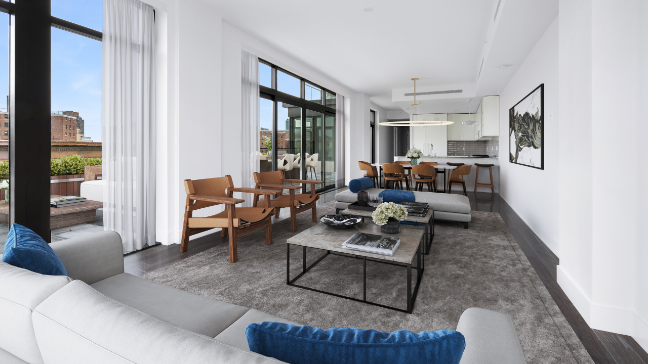
Rule of Threes means repeating any important design element at least three times and on varying planes and heights.
The planes in a room are generally the ceiling, walls, tables, seating and the floor and they appear at different heights. They are the stair steps the eye takes when moving up from the floor or down from the ceiling.
By repeating the design element multiple times your eye has a natural path to follow and it helps make the sensory experience harmonious through repetition and proportion.
When the eye doesn't know where to land or how to take in the room, the experience feels chaotic or unfinished.
Important design elements that can be repeated are patterns, colors, shapes, textures or materials.
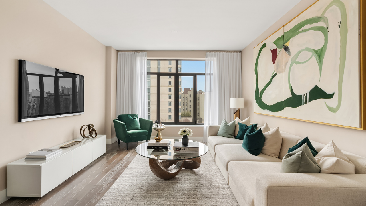
For example, in a master bedroom let's say there's a piece of artwork you love hanging over your bed. You could pull a color out of the art and use it in two of the pillows on the bed and then again on the bench at the foot of the bed.
The varying planes that appear at different heights in this example are the wall behind the bed, the flat surface of the bed and the top of the bench. Repetition is created and one color is being used in a larger proportion.
It's easy to learn and not too difficult to implement, plus it makes the world of difference when executed correctly.
I hope you enjoy experimenting with this design technique and add it to your repertoire.


